
For this post I wanted to do something a little different then my normal posts. I might even make it into a series if you guys all like it. I have a bunch more themes Id like to try out. The way this works is I pick book covers following a theme, in this case a seasonal theme, pair them off and then compare them in a battle for the best cover. Ill pick my favorite of the pair and explain why I think it did it better. Now let the battles begin!
WINTER
Queen of Nothing

Weight of a Soul

SPRING
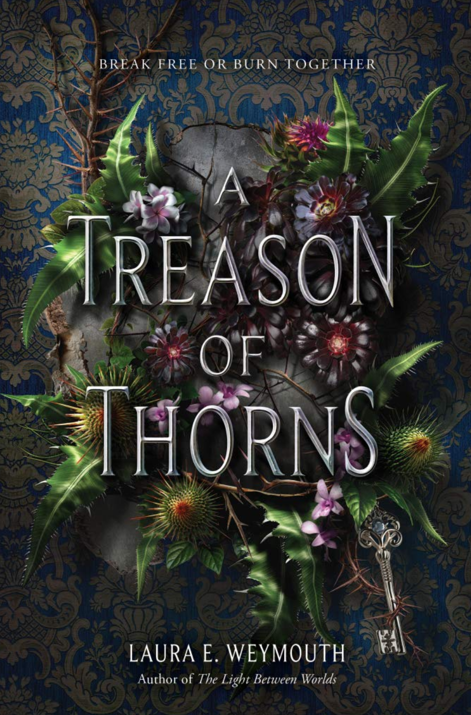
Spring makes me think if flowers so I picked two books with flowers as the main theme. I love both covers in this pairing, but Treason of Thorns does it so much better. I can tell a lot more time and care went into making it. It has a more realistic style while still being animated. I dont tend to love a realistic art on books but it work so well for the greenery and flora being depicted. I also prefer the detailed background to the plain one of Song of the Crimson Flower.
Song of the Crimson Flower

Treason of Thorns
SUMMER
These summer covers both showcase mermaids, but one of them feels way more generic then the other. The girl underwater has been so many times that a little more needs to be added to make it stand out. Having a mostly blue cover doesnt catch the eye as much as the cover with pops of purple and bronze. I also feep like Sea Witch Rising is more sharp and defined then the soft details of Song From the Deep.
Sea Witch Rising

Song From The Deep

AUTUMN
Unlike the spring covers where I prefered the more realistic approach here its the opposite. The realistic approach of Queen's Resistance makes it look like an old romance or historical fiction which doesn't appeal to me at all. They both have fall colors, but the contrast in those colors on House of Earth and Blood makes it pop way more.
House of Earth and Blood

Queens Resistance

Do you disagree with some of my picks?
No comments:
Post a Comment